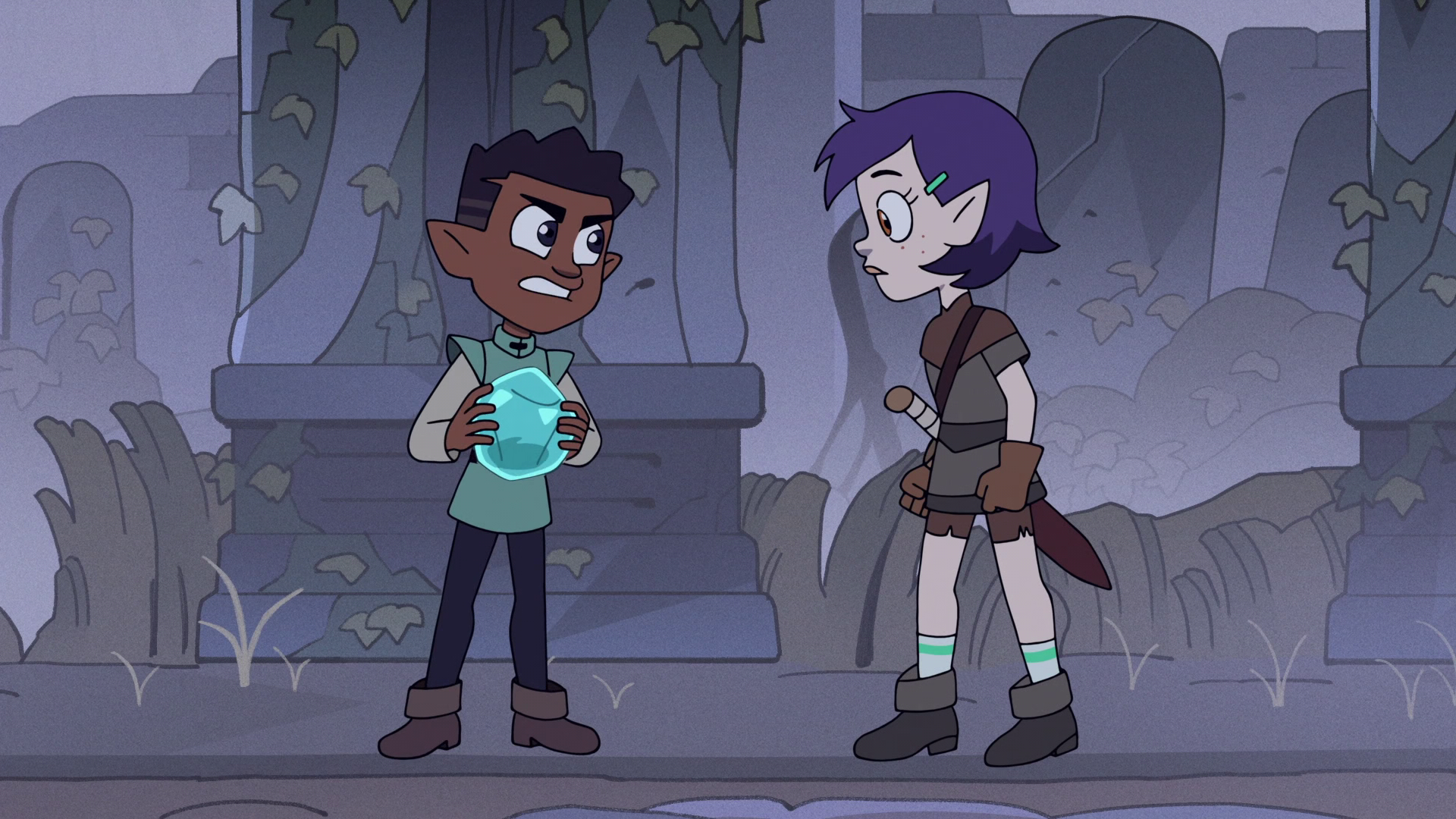
Hello there. The backgrounds of Dana Terrace’s masterwork of a show, The Owl House, had an art style that always fascinated me, ever since I began watching the show.
So, over some time, I pored over frames of the show to analyze what really makes them tick! And I think I’ve boiled it down to a small number of ingredients you too can use to make backgrounds like those found in the show.
To confirm my findings, I interrogated asked fantastic background colorist Solbi Park a large number of questions to confirm my findings. Some of her commentary will be included in the article. Seriously, many, many thanks to Ms. Park for responding to my inquiry.
I have now compiled my findings into my first long-form write-up about something I didn’t make. It will soon become apparent that I haven’t written an analytical essay since I was in high school.
For further clarification, this is a breakdown of the coloring style, rather than the content of the backgrounds. I will make another blog post later analyzing the composition of the backgrounds in detail, which will include the brilliant choice of color.
Without further ado, here is the list of magical ingredients:
- A subtle grain overlay.
- Triangles and zig-zags, Everywhere.
- Gradients. Everything is a gradient.
Now, let’s break them down, one by one.
1- The Grain
It took me a great amount of time to notice this at first, but notice that everything in the background has a subtle overlay of grain, or noise. As most of the textures in The Owl House are gradients, which we will cover later, this adds an element of visual texture and interest to the shot.
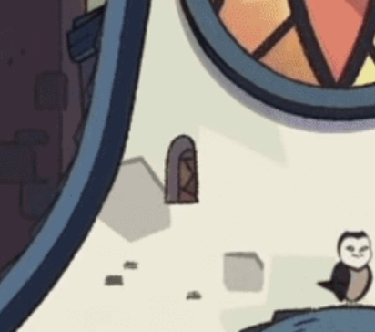
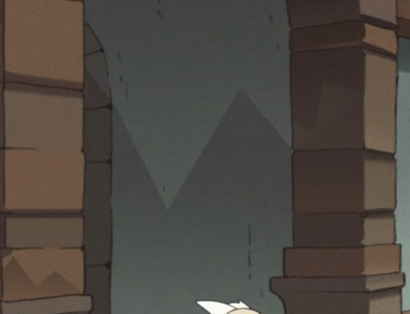
 Let’s take a look at this shot from Through The Looking-glass Ruins. I chose this example shot because it has a big flat stone with a light tint, which really shows the effect.
Look closely- notice a very, very light grain over the whole frame? Pay attention next time you watch the show- That effect is everywhere, even in the human realm, with a single exception I could think of, which I will discuss later.
notably, the characters are spared from The Grain. My theories as to why this is are as follows:
Let’s take a look at this shot from Through The Looking-glass Ruins. I chose this example shot because it has a big flat stone with a light tint, which really shows the effect.
Look closely- notice a very, very light grain over the whole frame? Pay attention next time you watch the show- That effect is everywhere, even in the human realm, with a single exception I could think of, which I will discuss later.
notably, the characters are spared from The Grain. My theories as to why this is are as follows:
- It was difficult to make it look good in motion
- Moving noise really does a number on normal video compression schemes, creating a blocky mess.
Park had no comment on this.
3- The Triangles
Now, this- once you notice it once, you will see these everywhere.
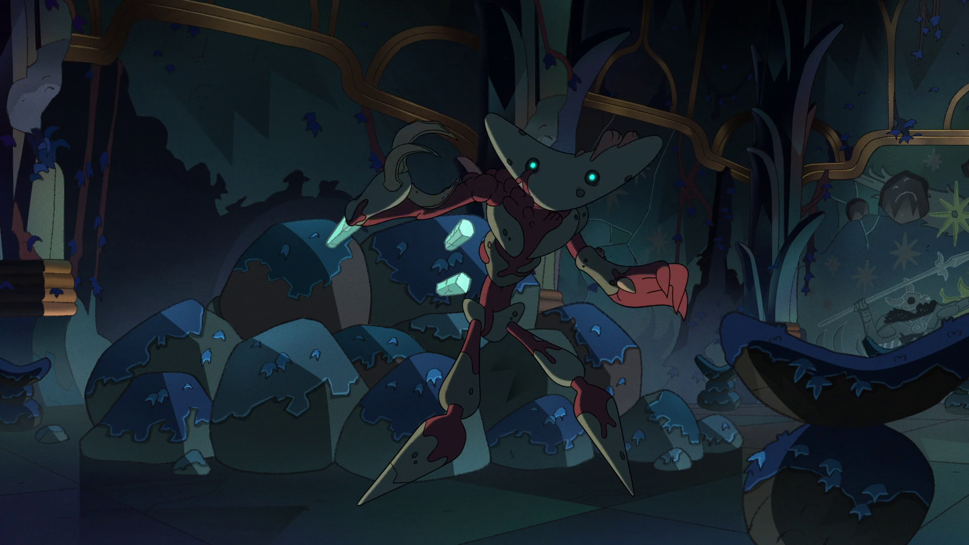
What do I mean by triangles? Look closely at any background in any shot. You may notice that everything is covered in triangles. Triangles everywhere. Doorframes, rocks, walls, objects.

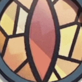
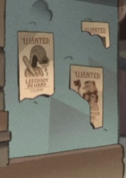
Notice the green triangles in the plaster, the triangles in the stained glass window, the triangles reflecting off the ice crystals, the brown triangles on the wall. Everywhere, I tell you.
They generally seem to point in the opposite direction of a gradient. I’ve also noticed some are more subtle while some are a lot more obvious.
I could not figure out the purpose of these other than giving a unique look, and could not find a pattern for where they were placed, so this is one of my questions to Park. I had theorized that the triangles were some sort of shape language to accentuate the danger of the isles, but it turns out I was wrong. This is what Park had to say:
I personally put triangles in the place where it looks a bit empty to make the paint fuller. For example, we put a lot of triangles on the ground with different colors to make the ground more interesting : ) I know this might be the most boring answer but to answer the questions on how I choose the colors or when to use subtle, stark triangles is because ‘it feels right.’ So yeah, there are not really any rules to them😂 I’m sure you know what I mean as a fellow artist! No shape language for the triangle, it was our AD’s* choice, but maybe he had a reason behind that I don’t know!
Again, the characters seem to be spared from this.
4- The Gradient
The last big piece of the puzzle is the gradients. Everything in The Owl House’s backgrounds is a gradient. Take a look:
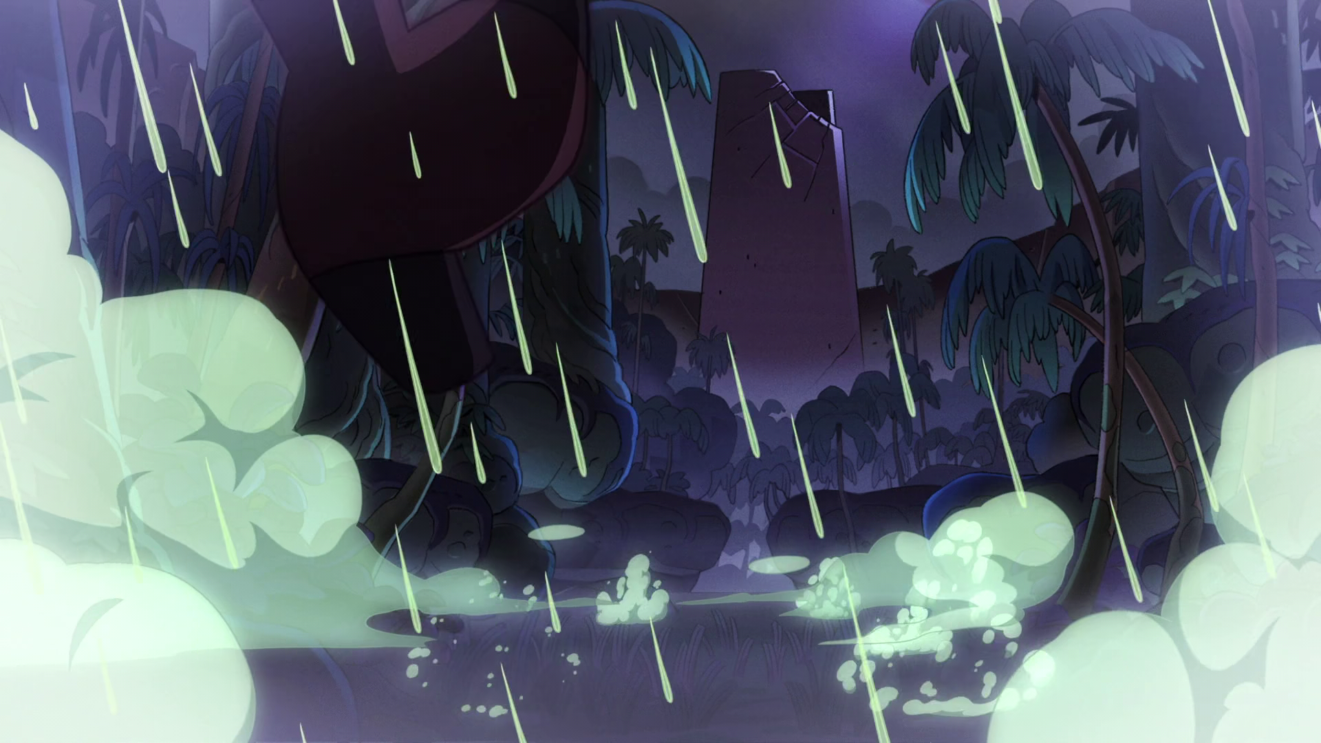
Notice the light coming from the bottom of the tower, and the blue light coming up from the bottom of those plants and rocks.
A bit hard to tell with the vignette, but the walls are going from green to blue. Notice the rocks, too.
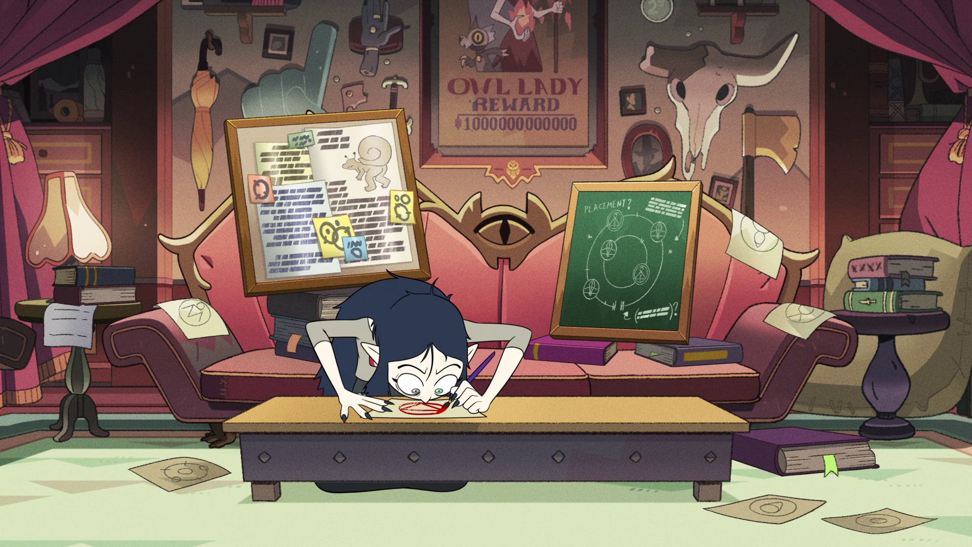
Notice how the couch lightens at the top, and take a look at the props in the background- especially the umbrella, hand, axe, and skull. Chalkboard, spine of the books.
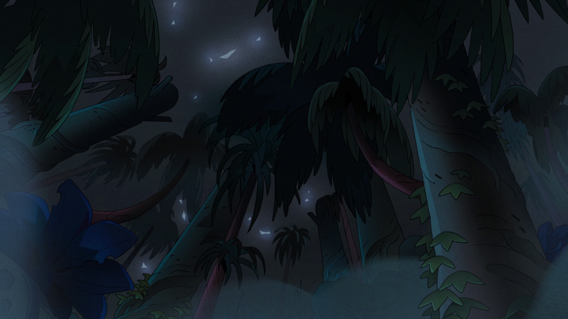
The trees have both going from side to side and top to bottom. Gradients are used to accentuate roundness.
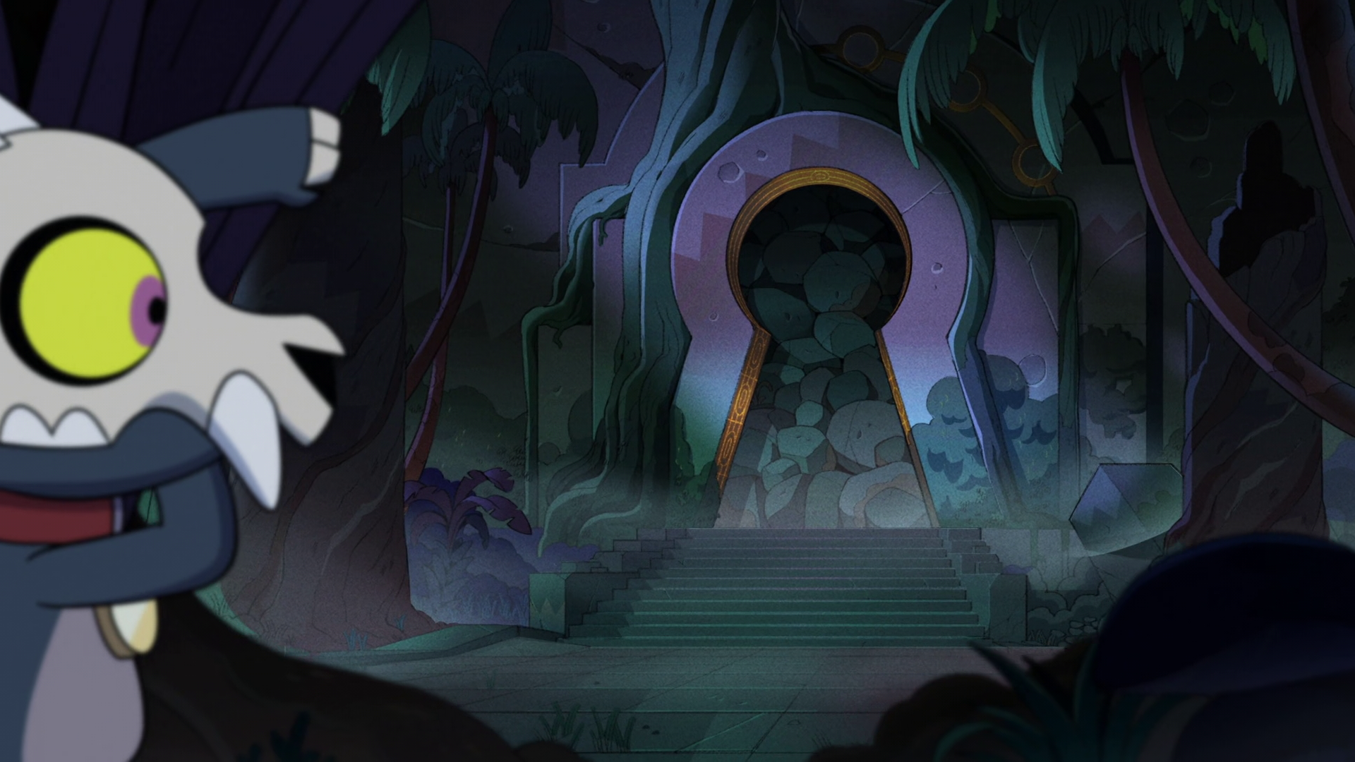
The keyhole door goes from a light blue to a muted purple. I like the rim lighting here. The triangles are very apparent. Also look at the plants and walls in the far background- look at the wall’s gradient merging into the triangles.
The walls fade between blues, greens, and a burgundy color.
Take a look at the moss on the wall in the background. It’s very subtle, but you can see it on the rocks behind Jean-Luc as well.
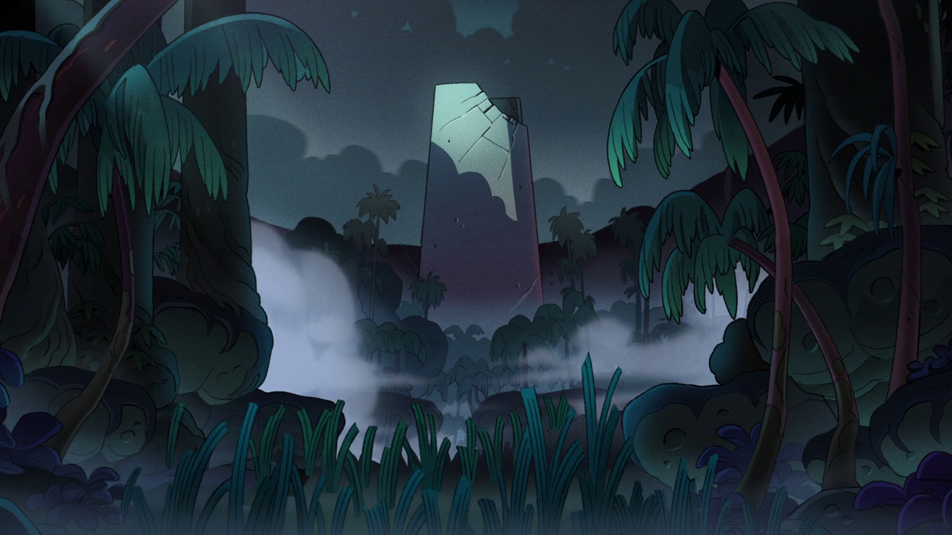
See the shadow of the tower- It’s light on the bottom, goes to a red, then to a lighter color to meet the moonlight cast upon it. the light parts get lighter towards the top-left side, emphasized by the slight bloom effect coming off the edge of the tower where the moonlight strikes the face. You can see a spooky underlighting on the rocks and plants again.

Notice the bones, and the round parts of the ship.
I Could provide many more examples, but literally every frame of this show has this. Pay close attention next time you watch.
I noticed that a lot of the gradients go from a lighter color to a darker color, with the lighter color being near the bottom, and where an object touches another one, and occasionally with some visual interest thrown in. This rule, however, is not entirely hard and fast, but it’s almost always true.
I was confused as to why this is, because while some gradients were obviously from light sources, some of them had no obvious source at all. My theory was bounce lighting, or what we in the GFX business call Global Illumination; that is, the colored light that bounces off of one object onto another, like when you shine a light on a red piece of paper and the wall lights up red.
Turns out, I was correct. Park confirmed this, as well as adding some extra notes:
We do treat the gradient like a bounce light, light bottom, and darker top. But we put the gradients on most of the objects even though there is no light source to create a spooky mood to it. So you are absolutely right about everything you said👍👍!
Very cool.
The counter-example
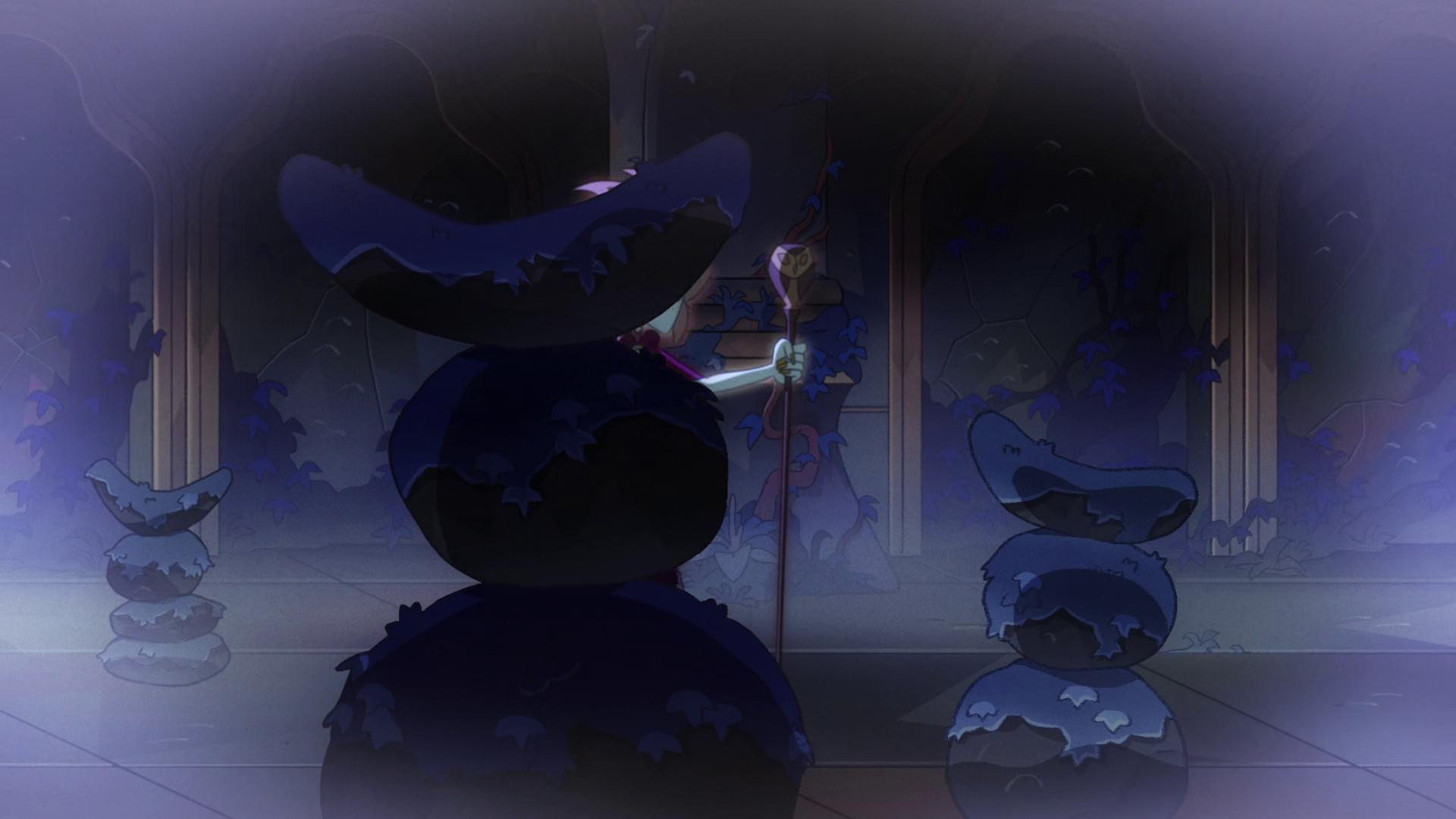
All that said, let’s look at an example where the rules are broken to show a place that doesn’t belong in the world. Slightly earlier in O Titan, Where Art Thou, we take a look at the, ah, space between worlds, or what have you, that the collector is trapped in. (This is written before the premier of season 3, so I’m not sure what it actually is, yet.) take a look at the very unnatural mix of red and green here:
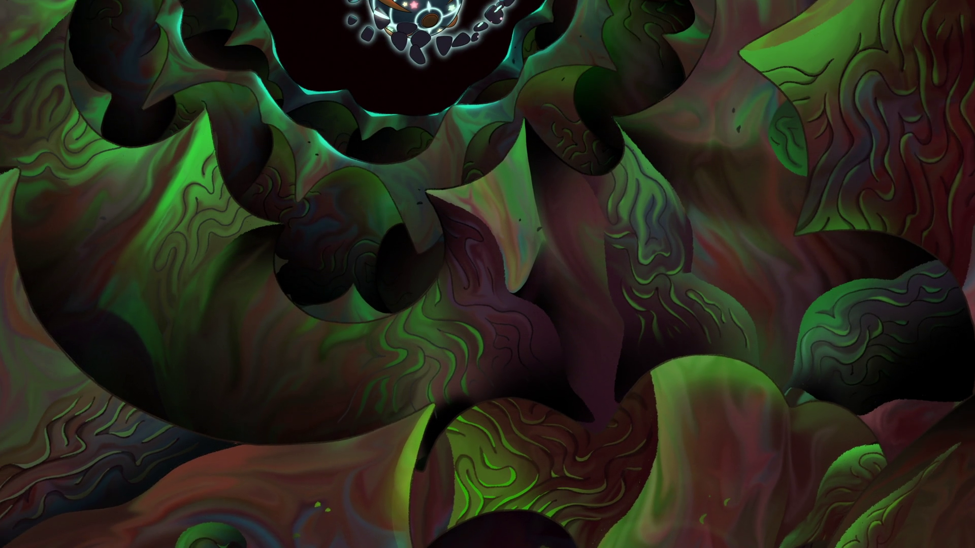 It has an almost iridescent look to it, with writhing, otherworldly markings on the walls. It reminds me a bit of Cruelty Squad’s menu.
This place is unlike anything else we’ve seen in the show- the smeared color blending in the walls, the harsh, complimentary colors, lit by the bright blue of The Collector’s poke-prison. Notice too, the absence of a grain layer on this, and not a single interest-triangle in sight.
It has an almost iridescent look to it, with writhing, otherworldly markings on the walls. It reminds me a bit of Cruelty Squad’s menu.
This place is unlike anything else we’ve seen in the show- the smeared color blending in the walls, the harsh, complimentary colors, lit by the bright blue of The Collector’s poke-prison. Notice too, the absence of a grain layer on this, and not a single interest-triangle in sight.
Whatever this place is, it’s truly beyond anything the more mortal characters have encountered before.
All in all, I hope you found this an interesting analysis of The Owl House’s background art style. Thank you for reading! And again, Thank you Solbi Park for your time.
If you have questions, comments, or suggestions for additions, message me on Tumblr!
*Art Director